It’s Low Hanging Fruit, but no one will call in about it.
There’s a generalization that if one person calls about an issue, then there are up to 10 others who never call in but have the same problem.*
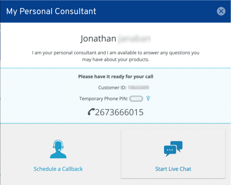
The above screenshot is a modal that pops up when you click on “contact us”. At first, this seems great: you can live chat, or schedule a callback. No searching for hidden phone numbers or navigating lengthy FAQ and help documentation.
However, it took me three months before I finally was able to speak to someone on the phone about my issue.
Although I am now embarrassed to say**, I pulled this window up once in a while, usually in the afternoon. I know this company is on the East Coast, so I assumed that there wasn’t a “call us now” option because it was already past their working hours.
Every time I pulled this up, I thought, dang, I must have missed them again. I don’t really want to live-chat because in this case, it was just easier over the phone.
I was especially duped since this same modal showed only the “schedule callback option” over the weekend. It seemed like a trend, to hide options based on time of day/week.
In the end, I scheduled a callback but missed their call. Then another callback that I didn’t receive for some reason. I started getting annoyed. Fine, I will call them when it’s not their lunchtime, nor is it past 5 pm EST. At 11 am on a weekday, I click that “contact us” icon, and the same window appeared. What, still? What am I missing?? I thought to myself.
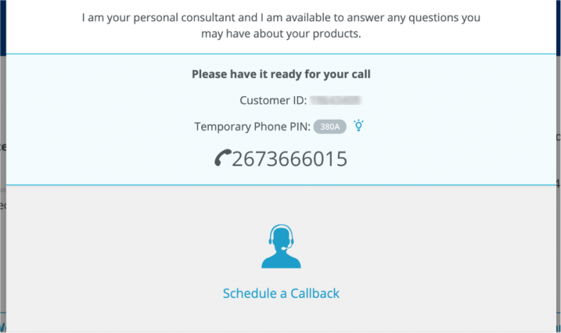
And that’s when it dawned on me: The phone number is right in front of my face 🤦♀️:
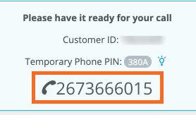
And it was even a link I could tap from my mobile phone! DUH. Why didn’t I think of that!? Well, actually it wasn’t that obvious. The other two options overpower the interface with icons, and the blue section in the middle looks like an information panel.
So I redesigned it:
The main difference is that I call out the option to “call now”, as the first and most prominent action. I styled the button and colors like the original modal has, to keep consistency. The blue “info panel” stays, because it is good information for when you do make that call.
I also made sure to show the phone number in case the user is on a desktop and needs to dial the number. Notice that it is formatted like a phone number so there are no questions about what those ten digits are.
* Source: Customer Experience 3.0 by John A. Goodman p.22
** When embarassment is the cause of the usability problem, the issue is even more likely not reported, because users think it was their fault.