
“Just make a button…” It’s one of the most noob requests that makes my hair stand on end. Why? Who needs it? Can we get the same effect in some more subtle way? Did you do any research? (likely no). “But it’s easy, and a call to action!” Yes… but does it do what the user expects? If not, then it’s worse than not having the button.
I had to make this argument to myself the other day, and after realizing I can ax 3 of the 5 buttons on my prototype, I just felt this sigh of relief. So. Much. Better.
This assignment is for my bootcamp in UX design at Bloc.io. Even before this bootcamp, I was thinking of making an app, just for fun. I was thinking of making it artistic, a movement of all the transit happening in the city like watercolor swirling around, but using the backbone of real-time data. It just happens that the assignment was to research and create the first couple screens of a transportation app.
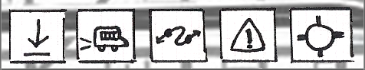
The ah-ha moment I had from above came after I had put these 5 buttons at the bottom of my app:
Then I thought to myself: this is a transportation app. Is there any reason why a user would want to disable seeing the bus lines or active buses on the map? ¯\_(ツ)_/¯ … and I could find no reason. Then I asked a couple bus users and they blinked, and said, well.. probably not. So I wiped two of the buttons off, moved the download button to a less important location… et voilà:
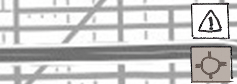 Why give the option of toggle if you don’t need to? Anyways, if there seems to be a legitimate reason to wipe the screen clean, I can always add them back. But for now, let’s just have a zen moment of less buttons 😎