This is the first of a couple posts I’ll be writing through the process of an unsolicited redesign of Mt. Hood Meadow’s website. Let’s jump straight into the analysis!
The Navigation
Number of choices
Theoretically, there are two levels of navigation:
- Sign in / Register – Shopping Cart – Blog – Contact Us
- The Mountain – Lessons & Rentals – Resort Services – Plan a Trip – Events & Race – Meadows PDX – Summer – Buy Online
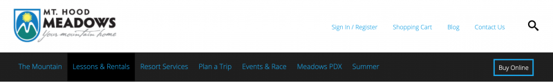
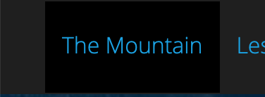
HOWEVER, there isn’t enough difference in hierarchy distinguishing which level is more important, essentially putting the tally of top-level navigation elements at 12. That is way too many!
Cognitively, humans’ short term memory limits us to keep tabs on between three to seven items at a time.
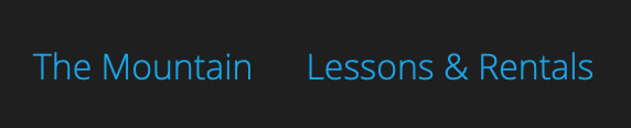
UI Issue: Furthermore, the contrast between the black background and the thin blue letters make the text hard to read, especially for those with visual impairments.
Menu Element Dissonance

The right-aligned “Buy Online” button is a top-nav link, even though it is perceived as different from the others by placement and dissimilarity via the blue outline. However, it acts the same as the ones on the left, also forming a drop-down when hovering over it.
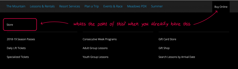
Three problems here:
- What’s the purpose of writing “Store” at the top? All the other top-level links repeat the same text as the heading, but really, it’s completely unnecessary.
- It covers half the page.
- The outline-blue link looks like a button. The user is not expecting the hover to reveal a menu. This unexpected behavior sets us up for subconsious cognitive dissonance/confusion later on in the site.
Secondary Menu
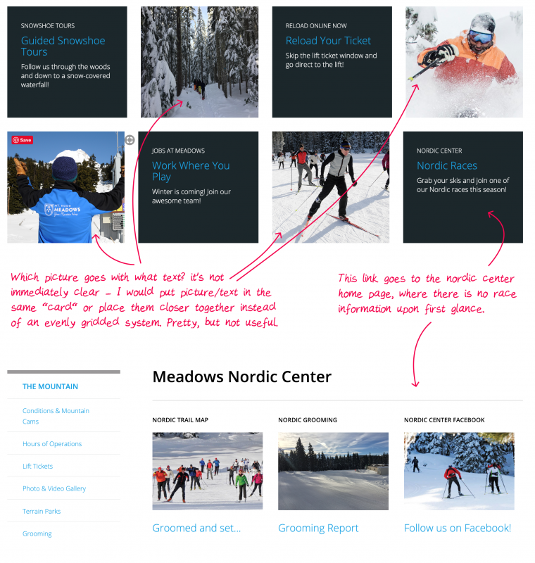
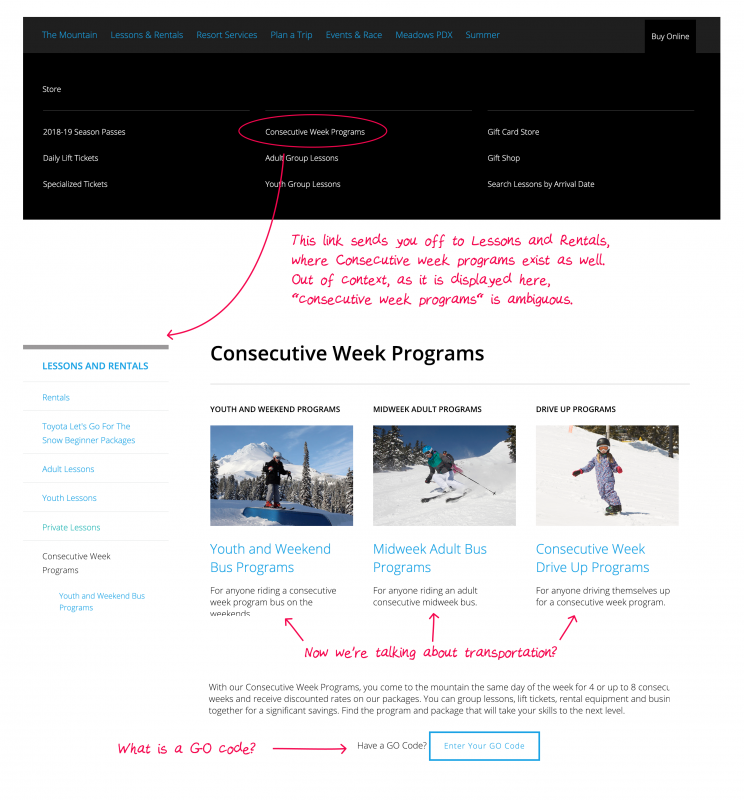
After clicking on “The mountain” (or any other top-level item), you get a page with 5 to 13 secondary items in the form of
These links are the same size and color as the main navigation, further diluting the hierarchy, only separated by a bolder-all-caps heading.
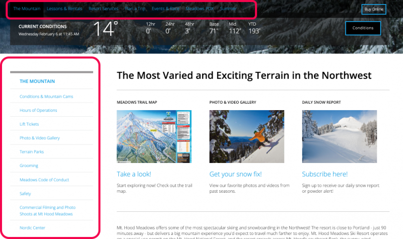
UI issue: “The Mountain”
The second (and bigger) issue is that the visual hierarchy is not apparent. There is no hint that there might be something else further under each of these headings as it becomes evident when you click on a link in the left nav. And even that is only sometimes – not all secondary links have tertiary items under them, so finding things becomes sort of like an easter egg hunt.
Example of drilling down the left nav
When someone clicks on “Hours of operation” they will expect a general outline of standard hours of operation such as
Monday: 9 am – 4 pm,
Tuesday: 9 am – 4 pm,
Wednesday: 9 am – 9 pm etc.
I took this screenshot in February.
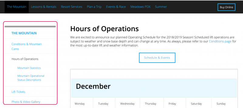
- I have to scroll to find the hours of operations
- Why is December the first month that shows in their scroll-forever calendar page titled “hours of operations”?
- Why is “Mountain Statistics” under hours of operations?
- What does “Mountain Operational Status Descriptions” mean?
- The “Hours of Operations” link on the left bar is now black. It’s supposed to indicate that you’re now on that page, or maybe that you’ve opened the accordion menu? Either way, it’s not very clear.
How to improve navigation
To improve the site, there needs to be tighter navigation with fewer options, with clearer hierarchy and titles. Breadcrumbs instead of the left-nav would remove the extra text on the page. This is NOT a store site like amazon or wayfair where the left-nav serves as a very useful filter system where
I would also recommend removing some of the links altogether, or consolidate because there is a lot of noise in the form of distracting elements on the page making the process of retrieving information like an easter egg hunt.
Finally, top-level navigation shouldn’t contain more than 5 elements unless you are dealing with a highly complex site and these top-level elements are clear and noncontiguous. *
Design Style
I took screenshots of some of their links and buttons to see what sort of design system the site was built on.
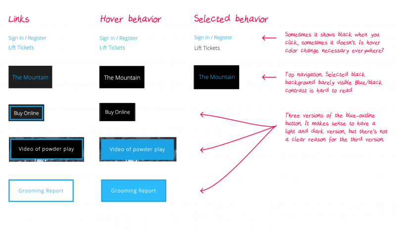
- They use the same blue/turquoise/black/white, but the colors are not consistent interactively.
- The site has the same typeface everywhere, but the readability is lacking in some applications where the text is very thin and small.
- The color contrast between the blue and black is 4.56:1 which passes the WCAG AA test for large and small text. 👍
Icon-buttons
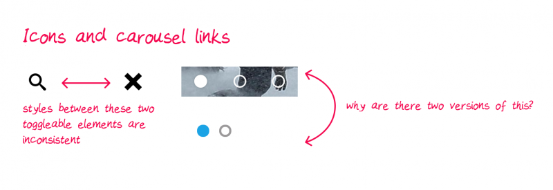
The carousel patterns differ in almost every way – color, spacing, border thickness. The purpose is the same, to scroll between panels (images and feature-content on the home page).
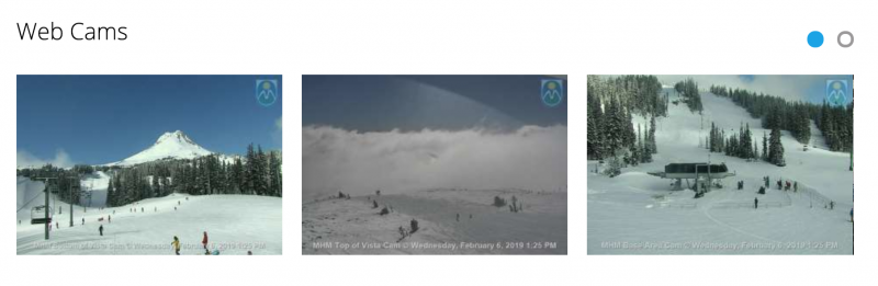
The only way to get to the second page is to click the gray-outline circle. Ok on a desktop, but try hitting that with your finger on a mobile phone if you had trembling hands due to a disability, or simply with a glove on (You can’t swipe right/left as it signifies).
Also, (and this seems to be a theme), these webcam images panel is hidden at the bottom of the page titled “Conditions and Mountain Cams”.
How to improve buttons/links
I would start by creating a basic design system where readability, contrast, and interactions like hover, select, tap, and swipe are considered and stay consistent throughout the site. Don’t make people re-learn what will happen when interacting with design patterns on the site.
For example, the image carousel should be swipe-able, especially when using the carousel pattern. Don’t put a pull handle on a door when the door can’t be pulled open.
Content
Clarity of content is another area where skihood.com could improve. While poking around the site, I constantly found places where links went to unexpected places, titles or descriptions didn’t make sense, and expected content was hidden way down the page.
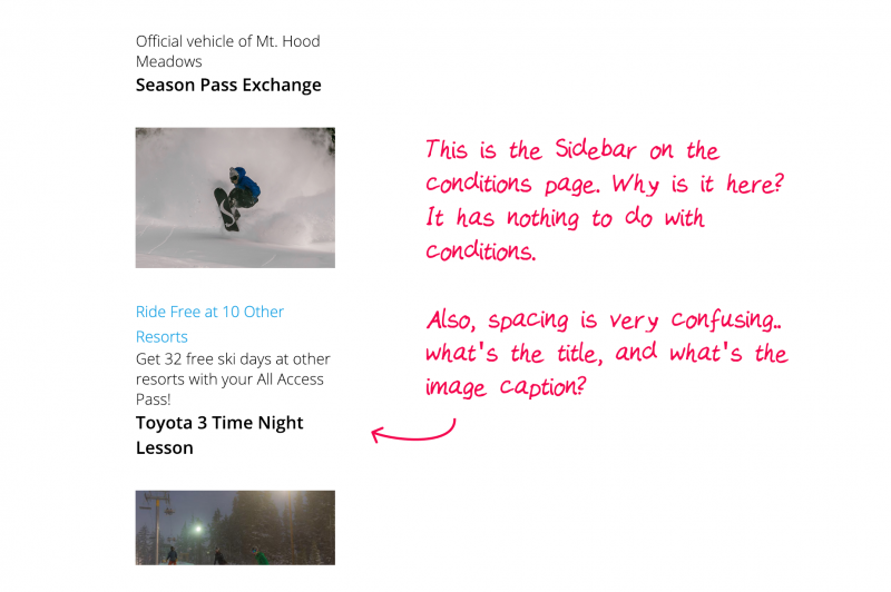
A sidebar with no relation to page content is very blog-esque, where the discovery of content is the expectation.
A ski resort website is not about discovery; users come to the site already with a pretty specific
Don’t make it hard to find!
How to improve content
Tightening up the navigation and information architecture on this site will have a lot of good impacts on content. I’d also check out the analytics for this site and see what pages are not being visited, and which pages have a high bounce rate.
A page that is often visited and has a high bounce rate indicates that users are getting to this page expecting something but end up not finding what they are looking for.
Either the thing they are looking for is obscured by other stuff, or not there at all.
What’s Next?
I’m waiting for results from a user survey and online card sorting. If you’d like to participate, check out the links!
I will be sharing the results and insights from these next!
Like what you see here? Check out my Portfolio for more information on my UX methods!
*According to Don Norman in “The Design of Everyday Things”
**Els Aerts talks about this topic
2 thoughts on “Skihood.com Heuristics”