This is the second post in my series on an unsolicited redesign of Mt. Hood Meadows’ website. If you want to start from the beginning, see my first post on heuristics.
In this post, I’ll be going through what I like about other selected ski resort sites in Oregon. I will focus on navigation and select content, as well as UI issues that really jump out at me.
Main Navigation
Timberline
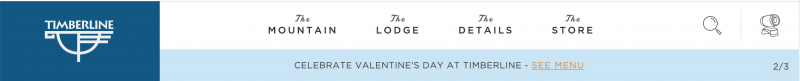
I like that there are only four main-level navigation headings. Four is much more easy to process than
Skibowl
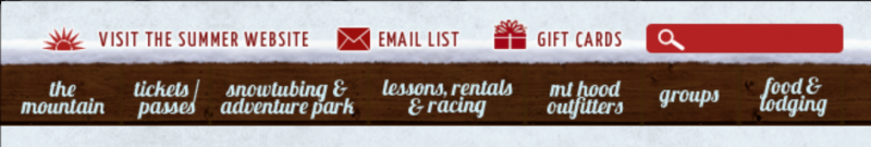
I’m not in love with the look of this site – it reminds me of sites in the early 2000s. But at least they are good about visually separating the main navigation with the extras navigation (in red). I’d argue about their color & typographic choice, and the necessity for so many main headings.
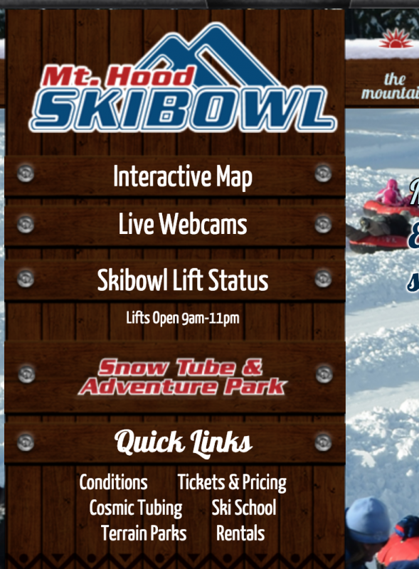
Skibowl has navigation on the left side in addition to the horizontal one, with bigger links. I think their intent with this left-nav is quick-access information, but its prominence interferes with the main navigation.
Sidenote – I like that the lift open hours are clearly stated here.
Mt. Bachelor
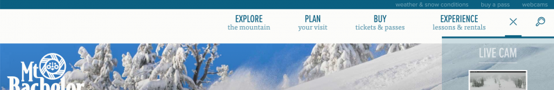
Out of the three resorts on this page, Mt. Bachelor’s navigation is my favorite.
- They use keywords like “Explore” and “Plan” in conjuction with smaller sub-headings. The combination turns into key phrases cueing what secondary items may be hiding underneath.
- They also keep the count of navigation elements friendly to human short-term memory.
- Their “extras” navigation is above the main navigation, on the turquoise bar. They choose to use it for the most common actions on the site. It’s the same purpose as Skibowl’s outrageously large left panel, but way more subtle and still pretty easy to find.
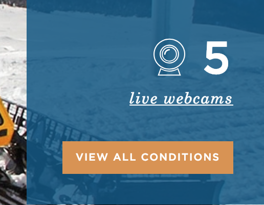
- To make sure visitors to the site don’t miss it, they have an extra dropdown – open by default – to the live webcams and snow depth + link to conditions. Clearly, they think this information is the most sought after. (And I have a feeling they are right!)
Secondary Navigation
All resort sites I’m looking at have one thing in common: lots of information. A good hierarchy significantly improves discoverability when browsing the site.
Timberline
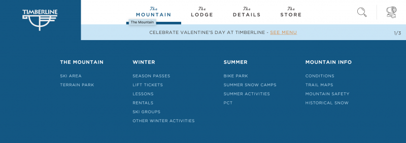
I like the distinct secondary headings in white. The headings and generous spacing clearly separate information into sub-sections, making information under each main heading more digestible.
Skibowl
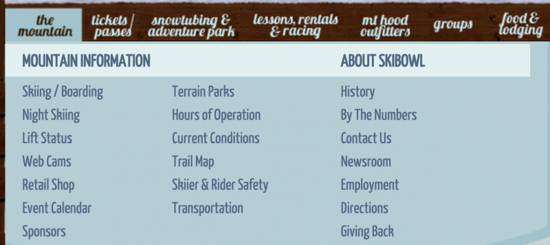
I keep cringing at the lack of a clean UI on this site. (I mean, why doesn’t the light blue extend all the way to the end of the dropdown??) In terms of hierarchy, they create secondary navigation under the main headers, which is a step in the right direction. There are still too many under “Mountain Information” in my opinion.
Mt. Bachelor
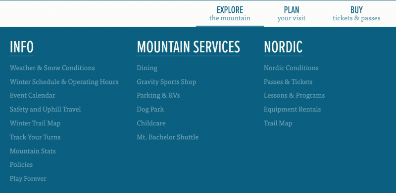
The contrast between background and foreground elements could be better. They have clear secondary navigation which creates well-grouped subsections, with a healthy number of pages under each subsection.
Mt. Hood Meadows in Comparison

Mt. Hood Meadows’ sub-navigation has several problems, especially when I compare it to the other sites above.
- They don’t have a secondary navigation structure
- The headings and content are too similar, diluting visual hierarchy
- UI Issue: The text is a tad bit too thin, even though the colors have enough contrast – in fact, if the text was thicker, I’d argue that the contrast would be too jarring between the pure #000 and #fff.
Select Important Content
Hours of Operation
☹️Timberline: I could not find it after a minute or two of searching
😃Skihood: It is very obvious, right on the front page
🙂Bachelor: It took me a couple of steps, but I found it within 15 seconds, under Explore the mountain > Info > Winter Schedule and Operating Hours
😐Meadows: It’s pretty easy to find the “hours of operation” page, but then I have to remind myself what day it is before I can scroll down to find today on
Webcams
🙂Timberline: There’s a webcam icon at the top of the page, which takes you directly to webcam images.
Another way to get there: On the home page, there’s a left sidebar with snow depth/conditions with a similar icon and link to webcams.
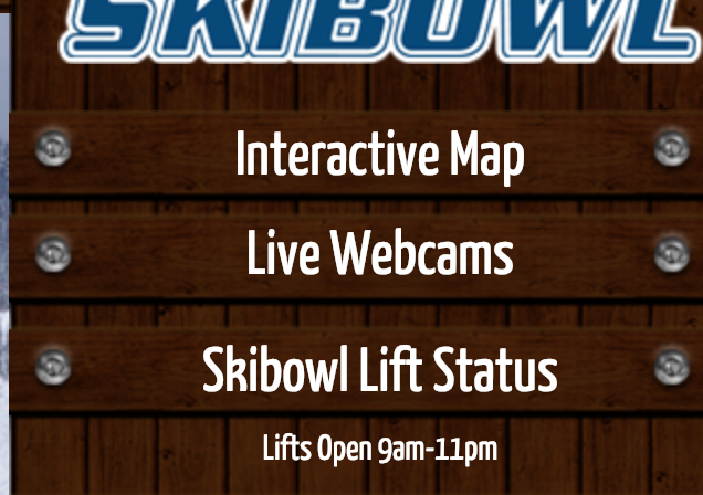
🙂Skibowl: Their webcam link is in the left-side navigation bar, with bold typography along with “Interactive Map” and “Skibowl Lift Status” links. It takes you directly to the webcam images.
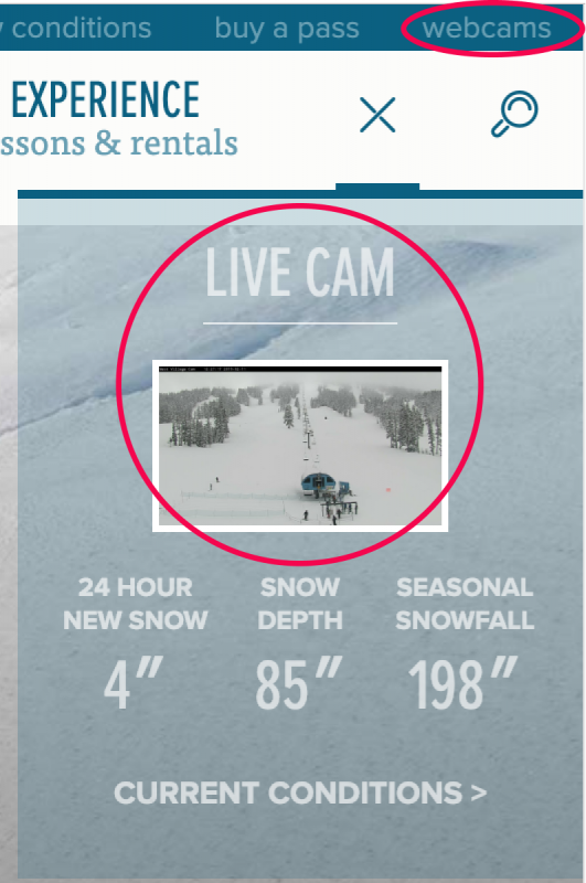
😃Mt. Bachelor: The webcam image is on the front page – BAM – it’s right there. But you can also click on the link above and get to the same page as if you click on the image itself.
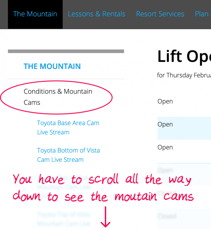
😐Mt. Hood Meadows: There’s no direct link to webcams on the home page. After clicking on “The Mountain”, I’m happy to see “conditions and mountain cams” under the secondary navigation (only after scrolling past the large splash-image). After clicking on the mountain cams page, I have to scroll all the way to the bottom to see the webcams.
Key Takeaways
Taking inspiration from competitor sites, these are the things I would port over to skihood.com’s site:
- Maximum of four or five main navigation elements like the Bachelor/Timberline sites
- Reconsider the location of “extra” navigation (such as shopping cart/blog/contact). I might put blog and contact in the footer since that’s typically where people expect to find this kind of stuff. And they are WAY LESS important than webcams.
- Including quick links which satisfy the top 3-4 reasons why people come to the site.
- Remove left navigation, and either place to the right (like Mt. Bachelor’s site does), or simply provide breadcrumbs.
- Pointing out the obvious: put content directly related to the page title to the top of that page.
One thought on “Skihood.com competitor sites”