This is my third post in a series on an unsolicited redesign of Mt. Hood Meadows’ website. If you want to start from the beginning, see my first post on heuristics.
In this post, I’ll reveal the results from a user survey, as well as a card sort directed towards improving the site navigation.
User Survey Results
Due to the niche group of users who visit Mt. Hood Meadows, I only got 16 respondents to my survey. Although I don’t believe this is statistically enough, for the purposes of this exercise, I will use their comments to direct my redesign.
Some demographic info
- All but one user said they visit the ski resort in the winter. Not surprising.
- Those who visit the resort more often overwhelmingly visit the site on their mobile devices. (10 out of 16)
Why do people physically visit Mt. Hood Meadows ski resort?
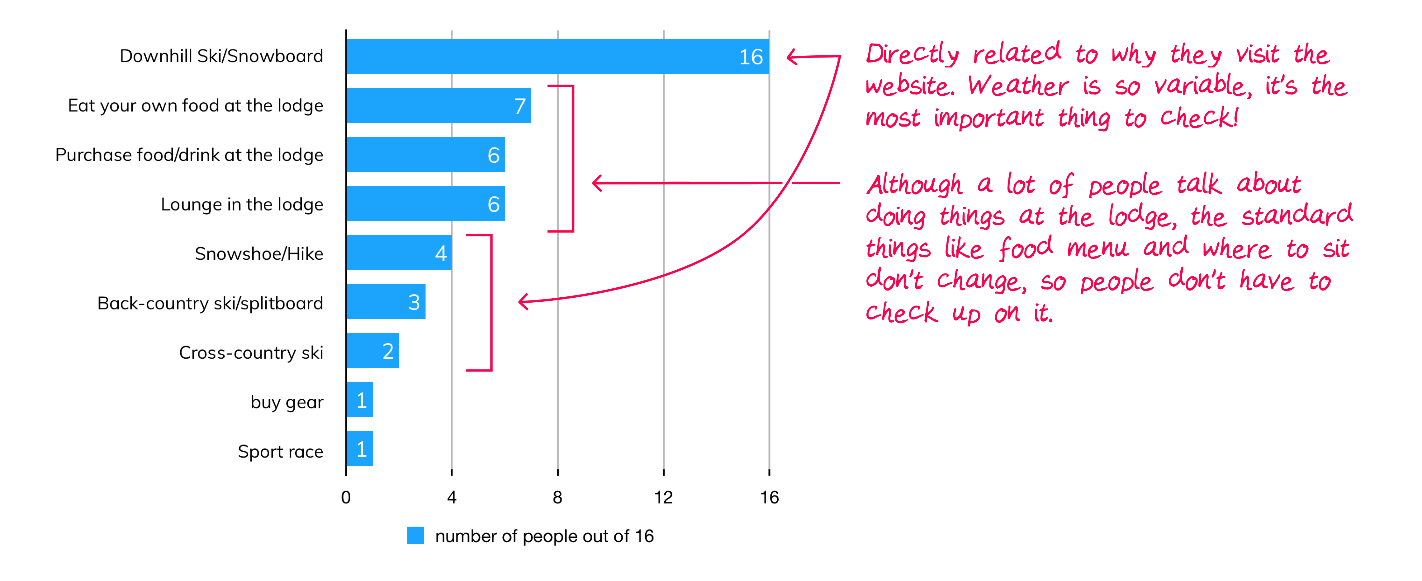
Top reasons people visit skihood.com

Recent snow accumulation (10/16)
View Webcams (7/16)
See ticket prices (7/16)
Combining visits to the site v. visits to the resort
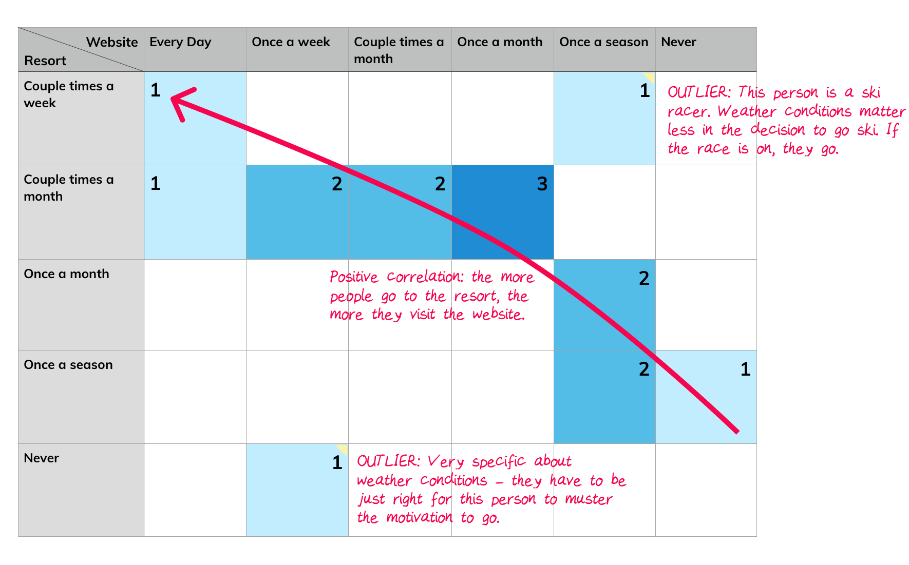
When combining this chart with why people visit the website, those who visit the resort most often check the site often primarily for weather, snow accumulation, and the mountain cameras. As we trail more towards the less frequent visitors, more of the other reasons come in – ticket price check, purchasing of tickets (presumably because they are not season pass holders), trailmaps. Regardless of which category a visitor falls in, all people care about weather conditions.
Personas
Will
He is a skier who visits Mt. Hood meadows at least once a week. He has a seasons pass and likes to check the website to see what the weather, snow accumulation, and what slopes look like via the webcams. He likes to check how many runs he made via the track my turns feature. Most of time he will check the day before he goes, or on the way there on his mobile phone.
Sometimes he will take friends so he also likes to check the ticket prices, or see if there’s a buddy-pass deal. He’s been to a couple holiday events with friends, so he also likes to see what special events are happening, but that is something he only does once or twice a season.
Jenny
She only visits Mt. Hood Meadows one or two times a winter season. She does not have a season pass so will usually buy day passes online. She skis, but also likes to lounge in the lodge, bringing her own food to eat. She visits the website to check the hours of operations of the lodge and skiing, check the resort trailmaps, view ticket prices, and see if there are any special events going on.
She is annoyed by not being able to see snowfall past 48 hours. Sometimes the webcams are foggy or covered in ice, limiting her visitibility.
What’s frustrating about skihood.com?
“It can be difficult to navigate to their special ticket packages.”
“Um, everything! It’s hard to navigate, and it not
user friendly ”
“[There are no] recent snowfall and conditions beyond 48 hrs”
“Signing up for racing and finding the racer waivers.”
What do you like about skihood.com?
“I can find the conditions report immediately from the home page.”
“Site always seemed very complete to me and I remember that it seemed quite personal with daily manager comments. It always seemed like the people running the place (and site) were also just skiers/boarders that want to have fun.”
Card Sort Results
The purpose of this card sort was to see how people categorize and group typical ski resort website content.
I also want to pay specific attention to content that the survey showed to be the most important reason users visit the site: Weather conditions, snow accumulation, webcams, and ticket information.
I used optimalworkshop.com‘s card sort test. Ten people filled it out, categorizing the thirty sections under “The Mountain”, “Plan your stay”, “Rentals and Lessons”, and “Tickets”. I also allowed people to create their own categories.
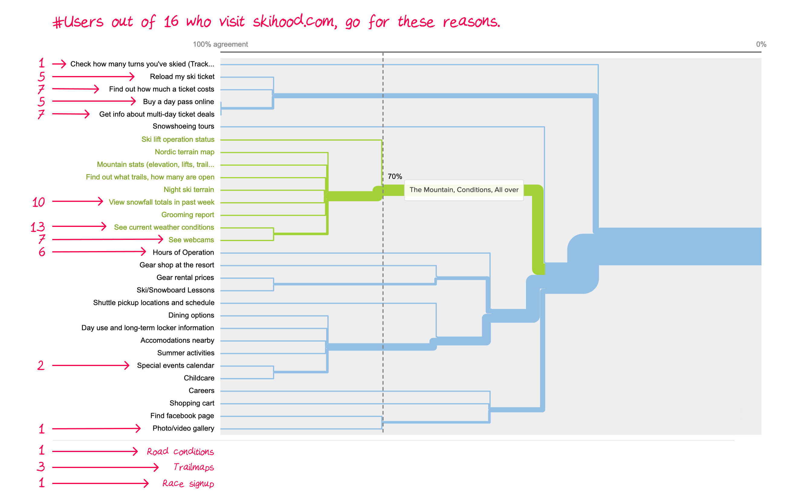
As I noted in the competitor analysis post, the resorts with four top navigation menus with sub-headings under each were the easiest to navigate. This dendrogram gives me a good divide between those four categories I named above. It also shows those sections that didn’t really fit any of the four categories: Track your turns, Snowshoeing tours, Careers, Shopping Cart, Find facebook page, and Photo/Video gallery.
Resulting Information Architecture
To come in the next post!
Sneek-peek: the improved navigation will contain four top menus, with sub-menus for the content.